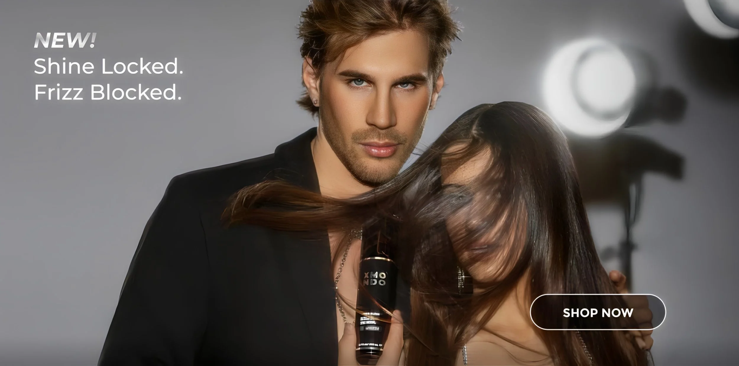
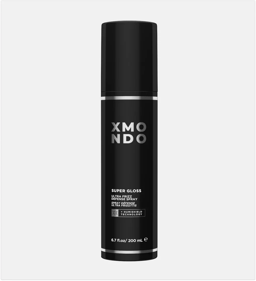
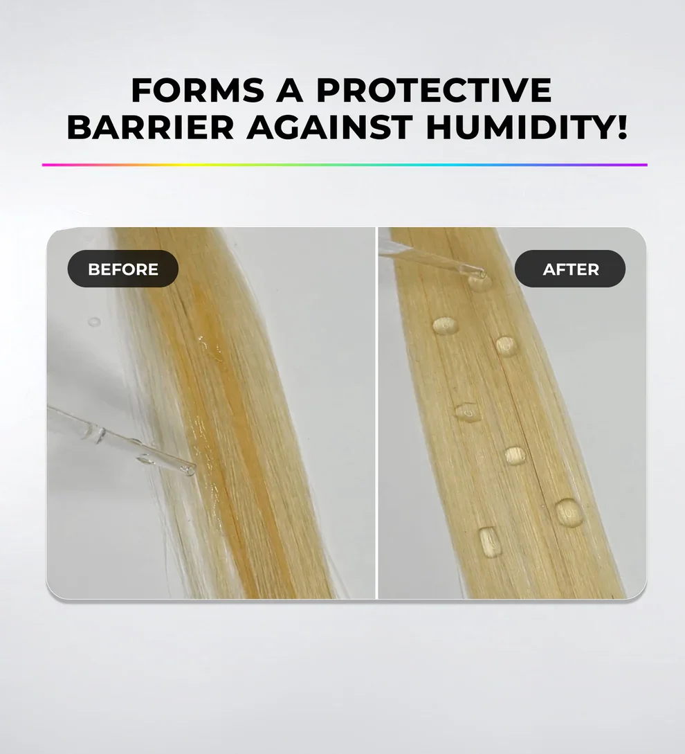
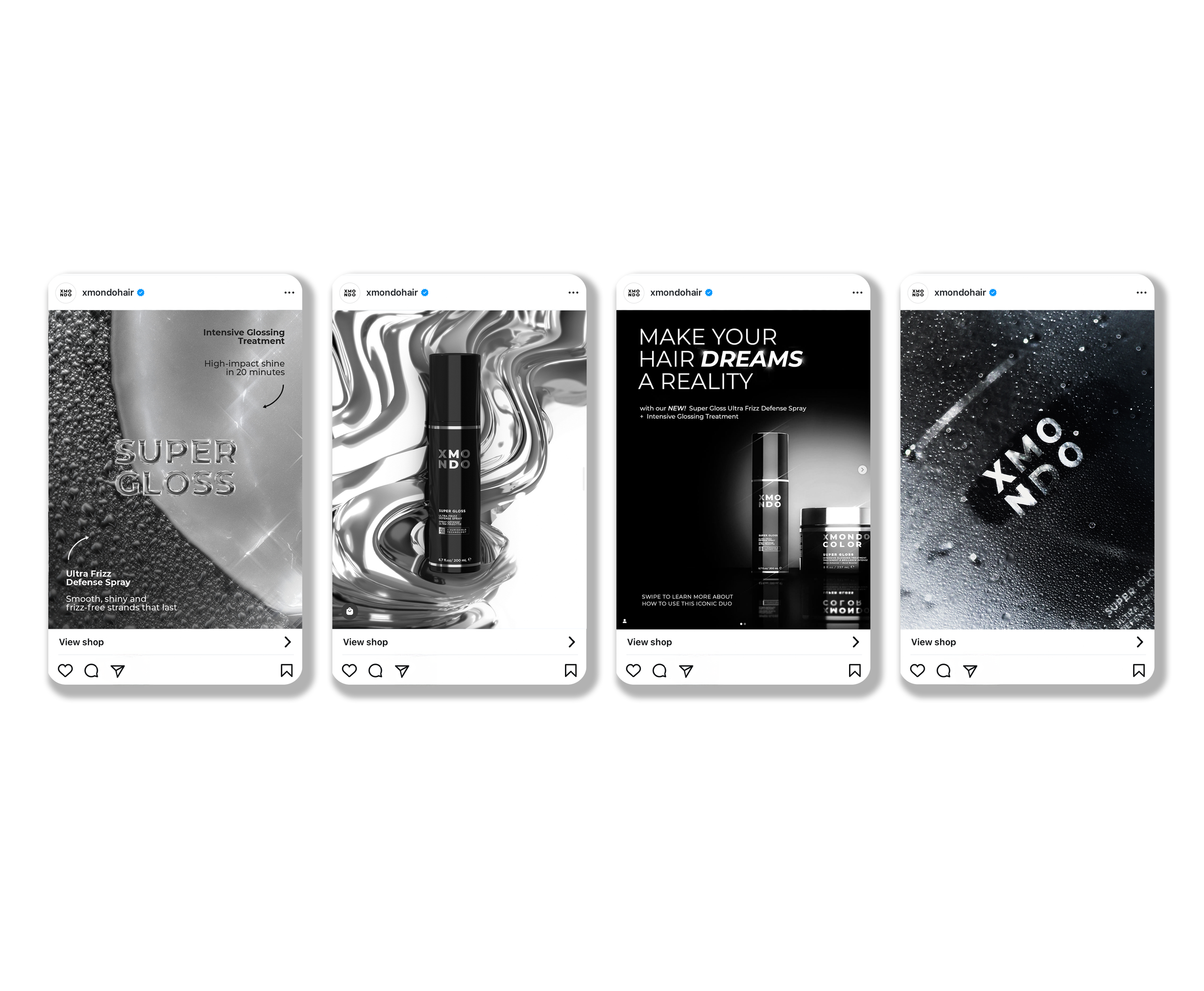
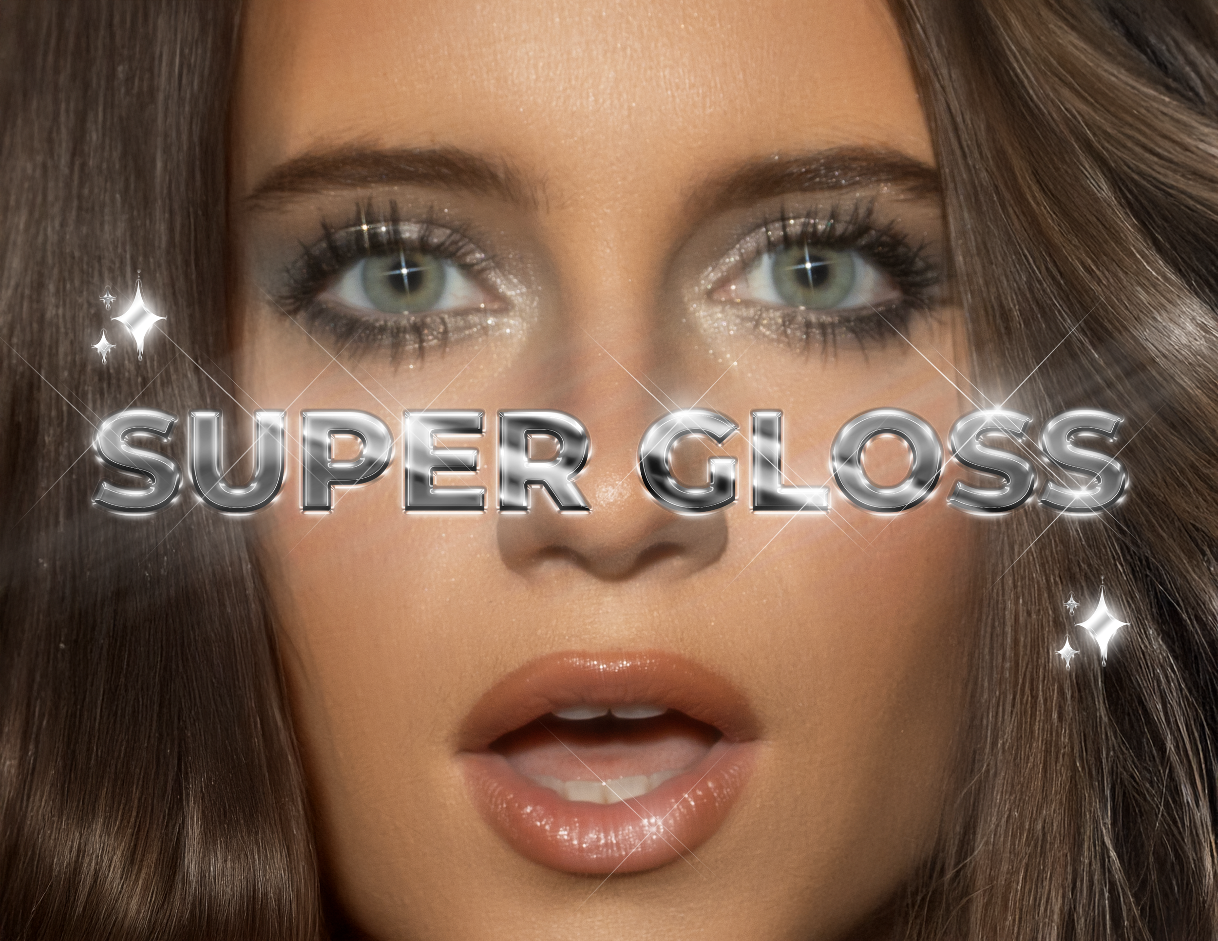
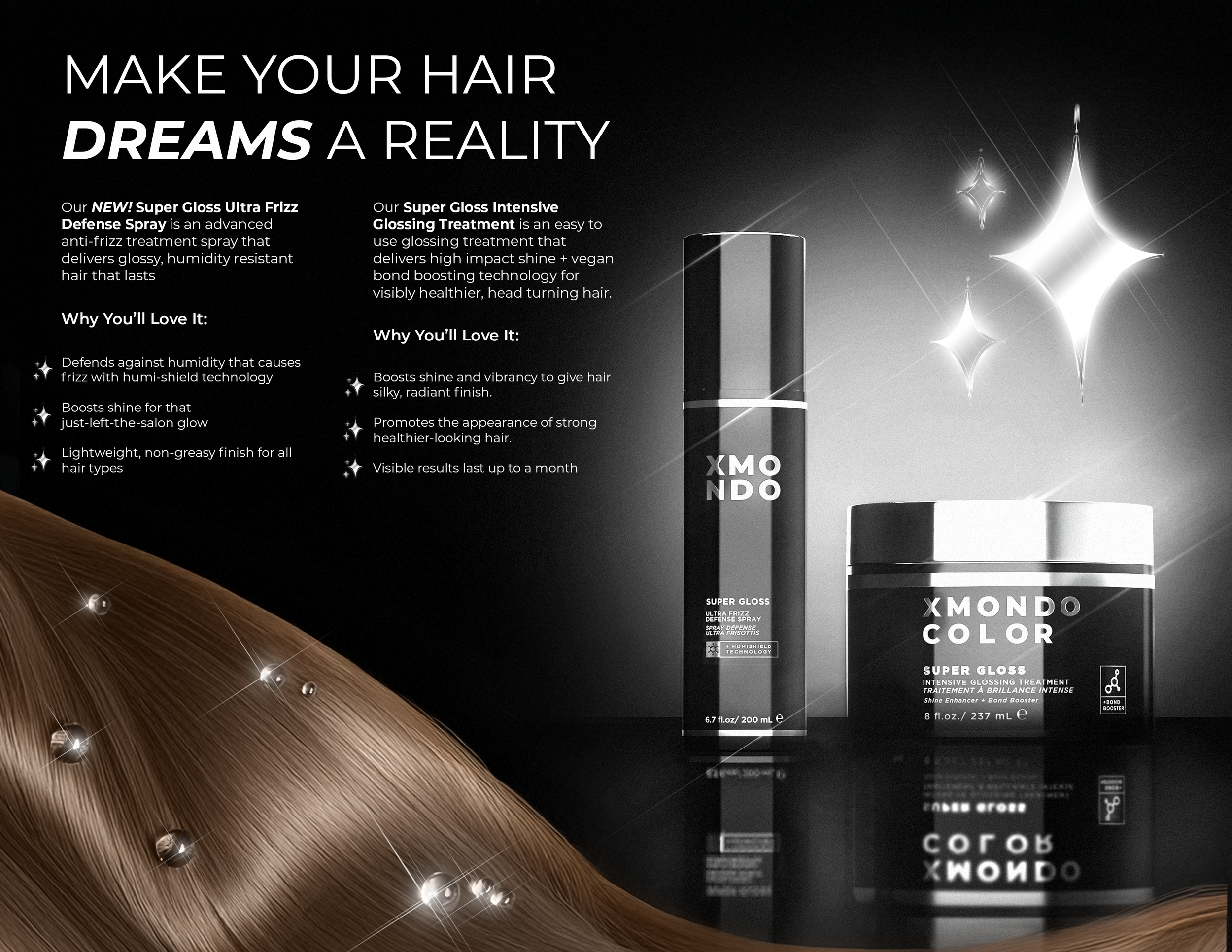
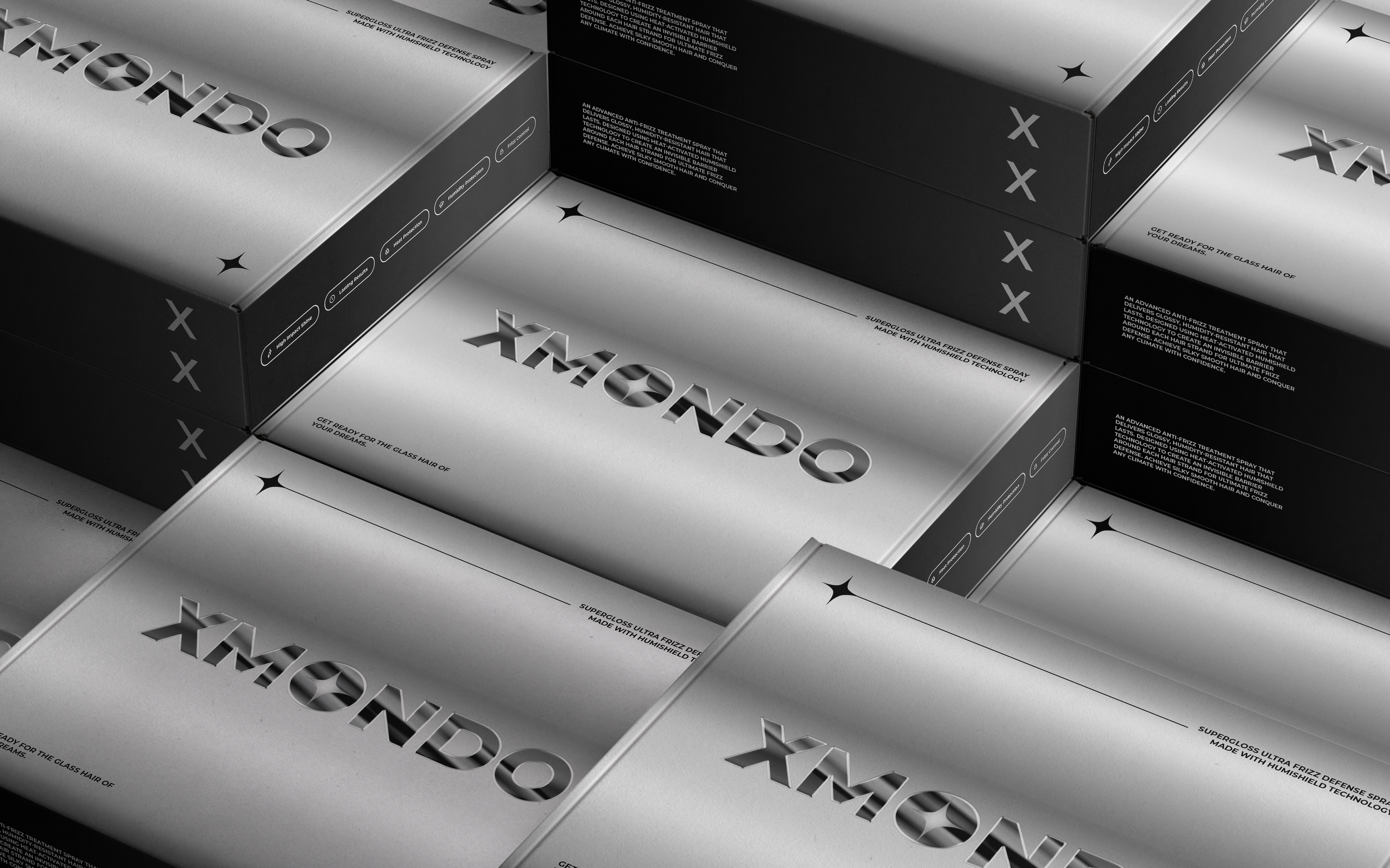
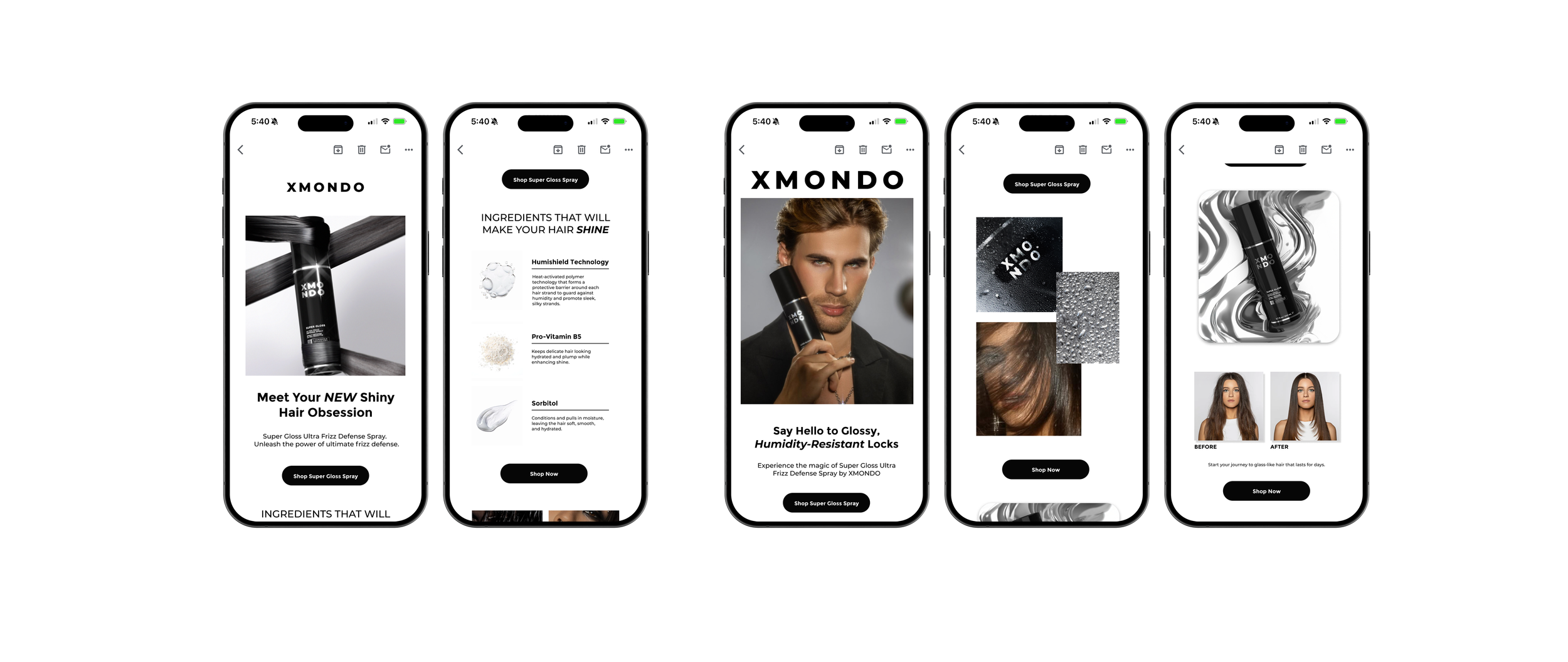
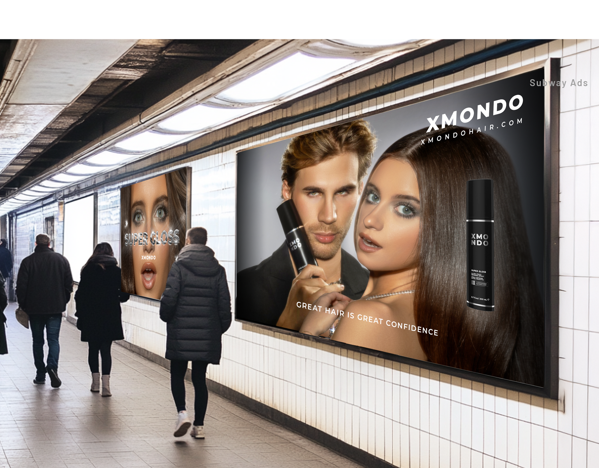
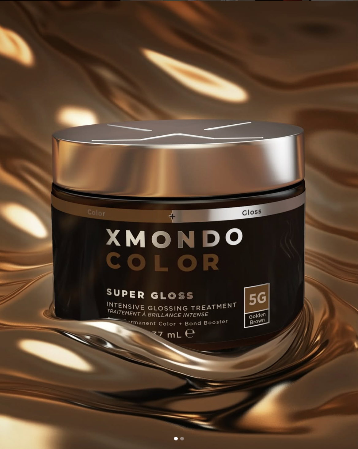
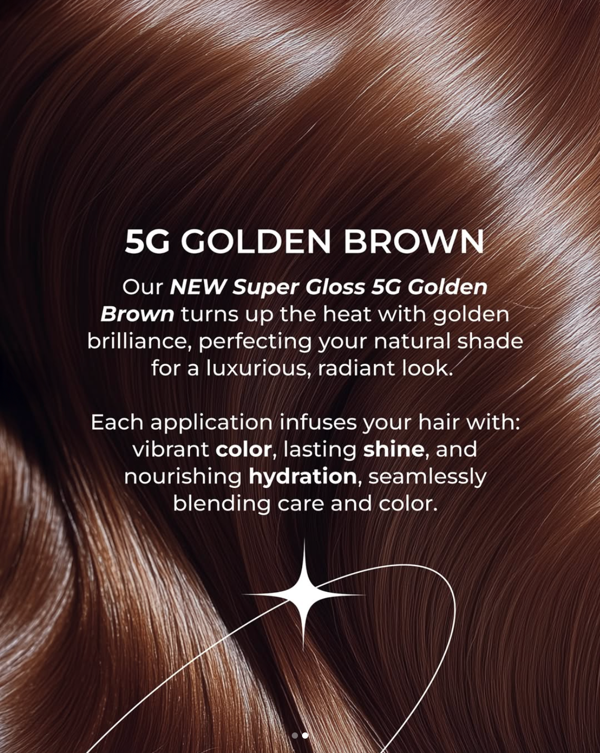
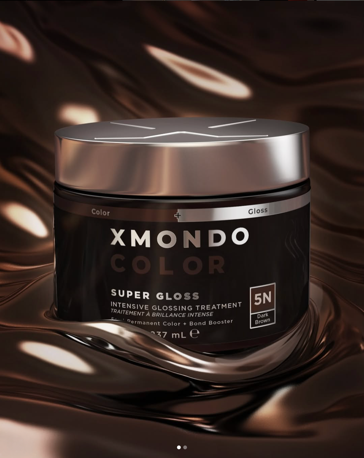
The creative direction came from a close read of the product itself. Packaging informed the visual language from the start, pulling texture, finish, and form into a system that could flex across 3D renders, web banners, social, Amazon, print, and PR postcards, and PR articles. Color was used as an accent only, letting shine and surface do the heavy lifting.
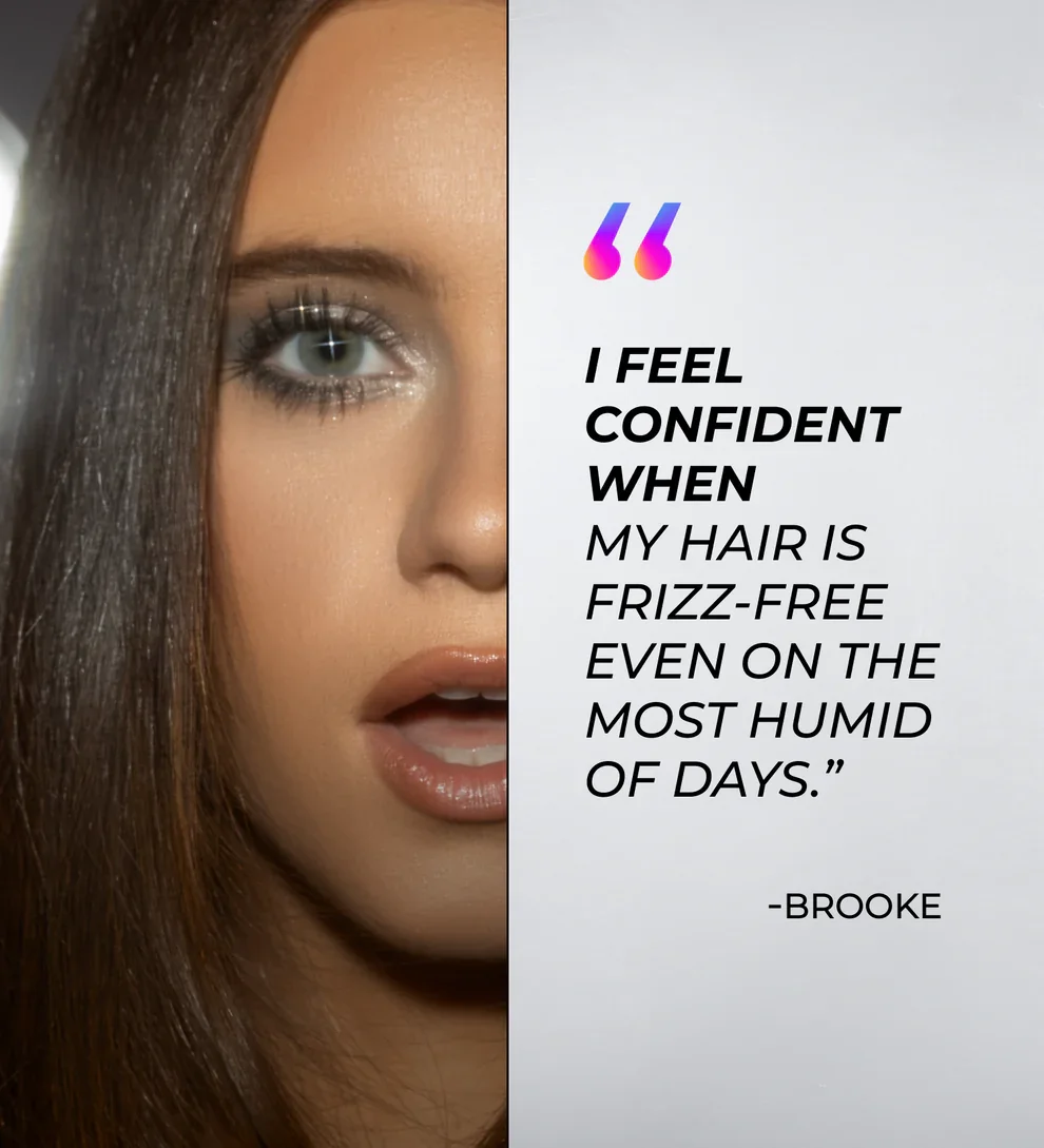
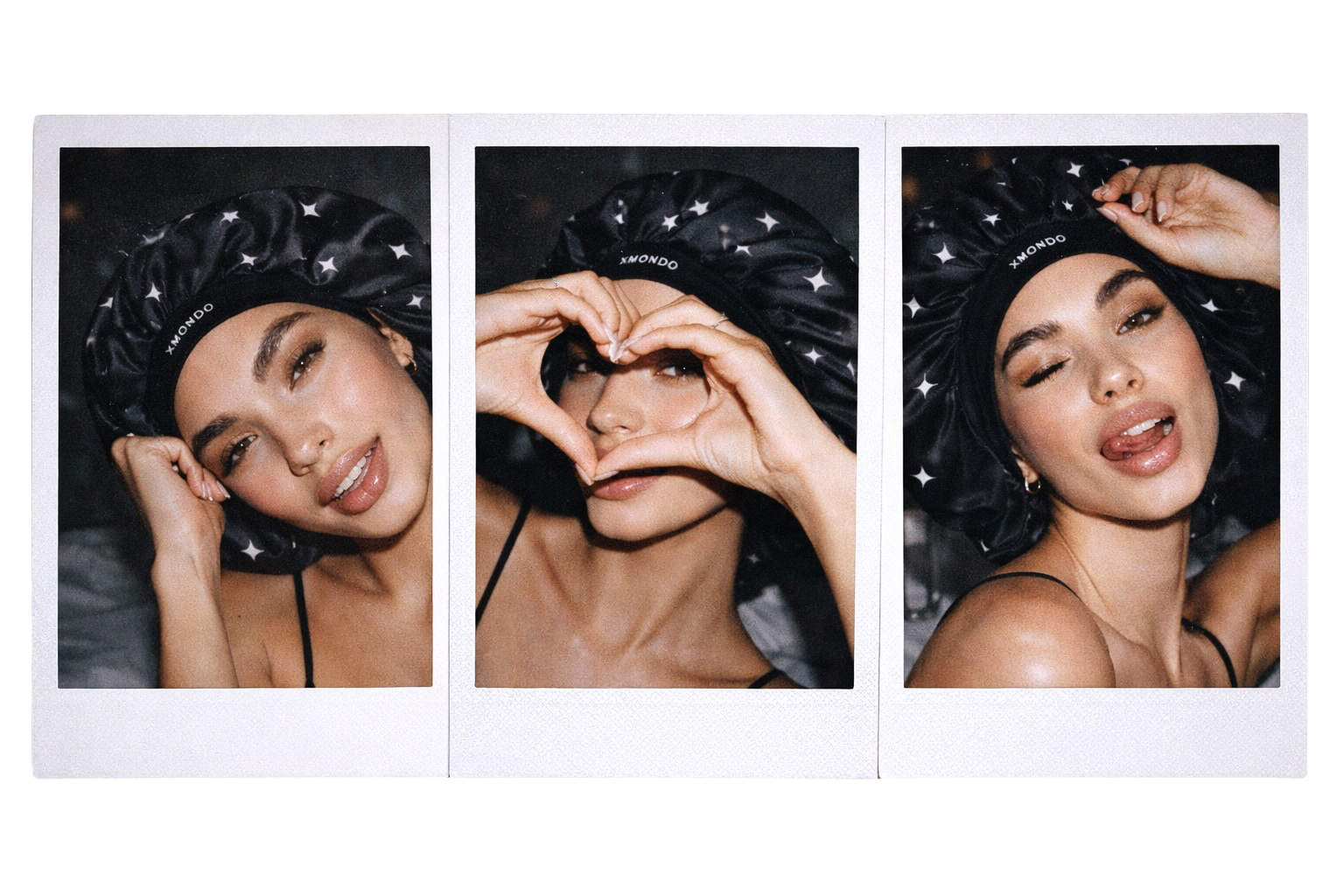
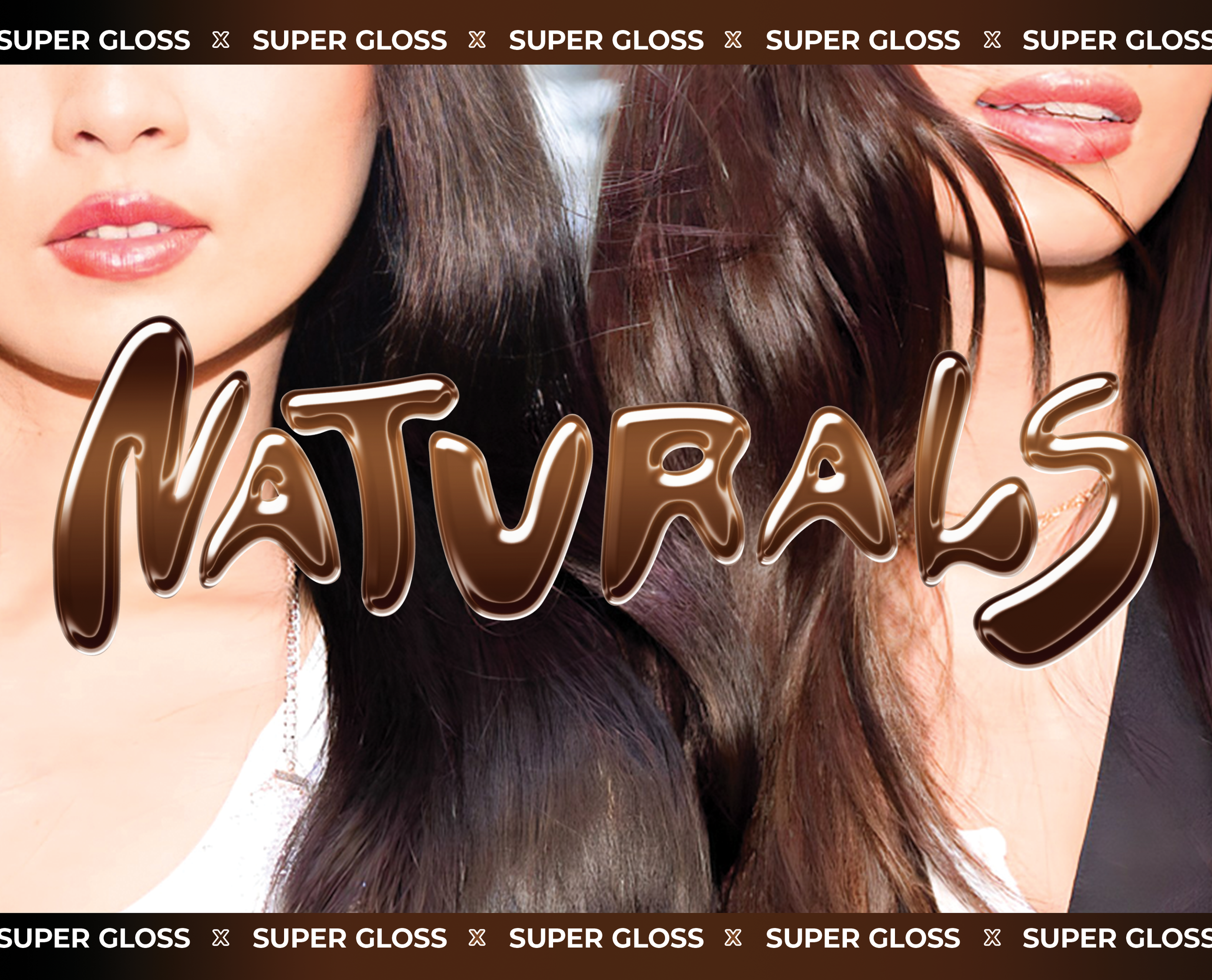
Research into Gen Z content behavior shaped the social approach early. Organic-feeling content was outperforming polished production at the time, so the strategy leaned into that, pairing high-end renders with in-house footage edited to feel native to the feed. Mood boards helped define the hazy, luminous aesthetic before a single render was built, giving the campaign a clear visual north before execution began.
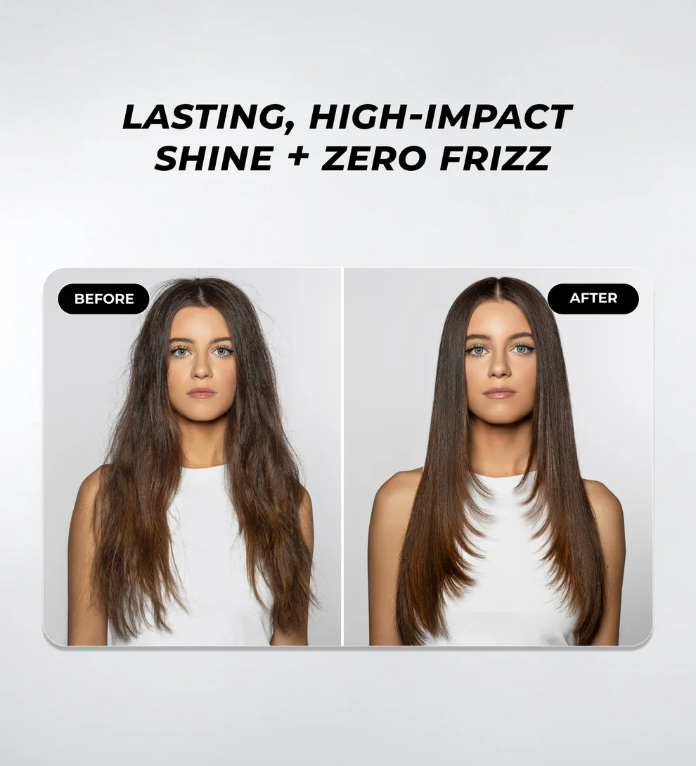
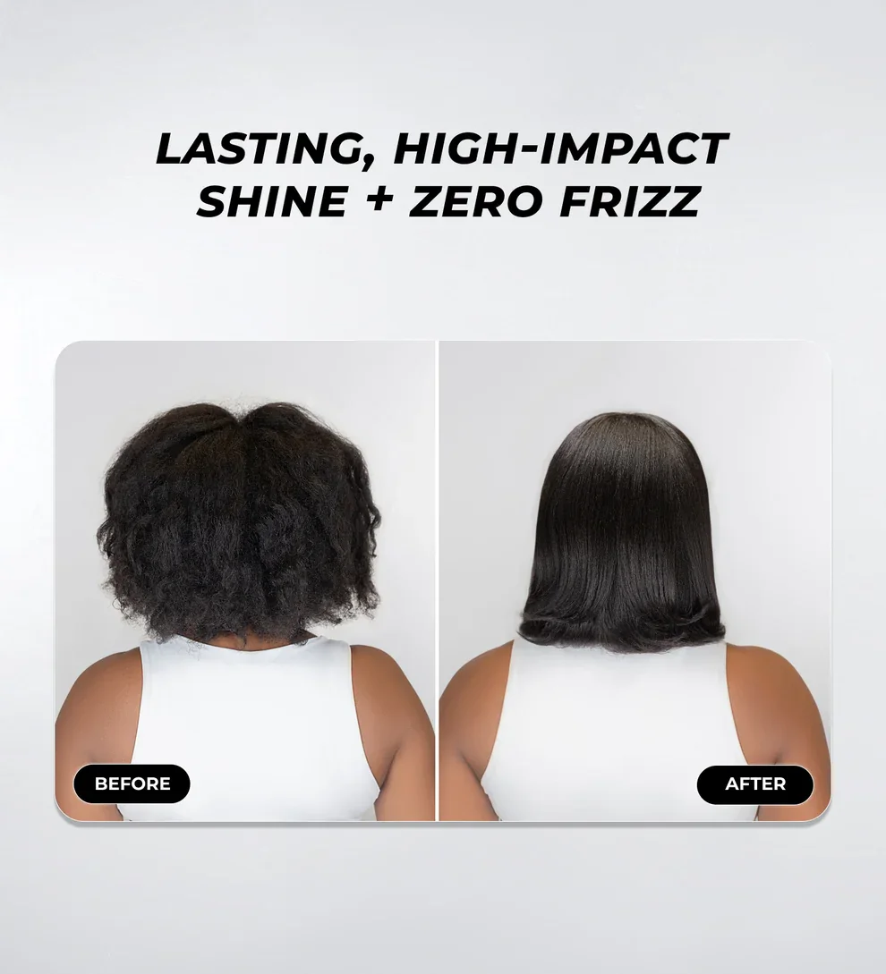
All assets, across every format, were produced independently and delivered on schedule. The work drove over 1 million in social engagement.